2023 – The year of change.
Every company has a story, an essence that defines it, and often, this essence is reflected in its logo. Today, we are thrilled to unveil a new facet of our identity with our freshly redesigned logo.
For this pivotal task, we sought the expertise of a talented graphic designer, known for his ability to capture the soul of a brand. Through this new emblem, we wanted each detail to resonate with a part of us, our team, and our mission. Read on to delve into the behind-the-scenes of this transformation and understand how this logo became the perfect reflection of our essence.
And without further ado, discover the logo that has won our hearts!
Before

After

The Story of Les Chats Gourmets
Nearly four years ago, inspiration struck: to create a unique cooking blog. Three key elements stood out: a distinctive logo, an appealing website, and unforgettable recipes. In the excitement of this new venture, in a flash, sitting around a table, our very first logo was born, ready to shine on our website and social platforms.
Over these four years, our passion manifested in the continuous enrichment of our site with tempting and easy-to-make recipes. Alongside, we’ve built strong connections with our growing community.
Today, with its robust digital presence, our brand yearned for a metamorphosis, a deep introspection into its visual identity.
The Creation Process
The quest for this new image led us to Charles Morissette-Proulx, a Canadian graphic designer and illustrator of undeniable talent.
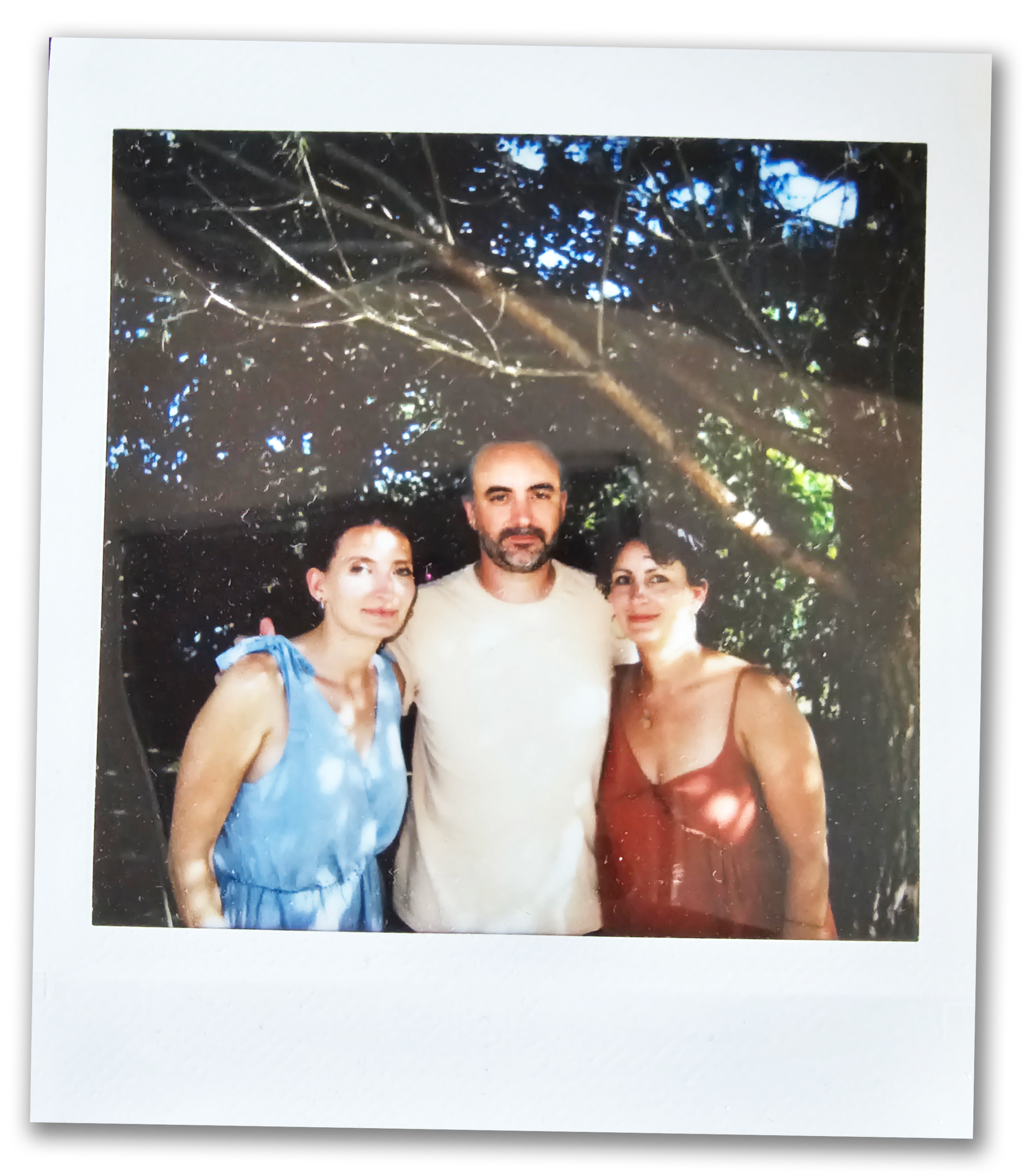
Our vision was clear: a vibrant logo, encapsulating the essence of the three founders. The challenge? To subtly integrate each one’s taste preferences while adhering to strict chromatic accessibility standards. Every shade, every stroke matters.

Decoding the Logo

The Cats
Two sisters and a brother, translated into three distinct felines. Each embodying a blend of personalities, roles, and
The Composition
The arrangement of the cats symbolizes their harmony and diversity. The triangular orientation of their heads provides optimal readability, evoking a sense of unity.
The Lettering
Each letter, hand-sketched, is positioned to instill dynamism and spontaneity into the name. The word “Les” sits atop the “C” like a chef’s hat, while the “R” stretches gracefully, reminiscent of a cat’s tail in motion.

